
Is your insurance agency website a lead-blocking barrier? Discover how to transform it into a powerful conversion tool that attracts and retains customers! Learn the essential elements of a high-performing insurance agency website design and elevate your digital presence to drive more quotes and thrive in a competitive market.
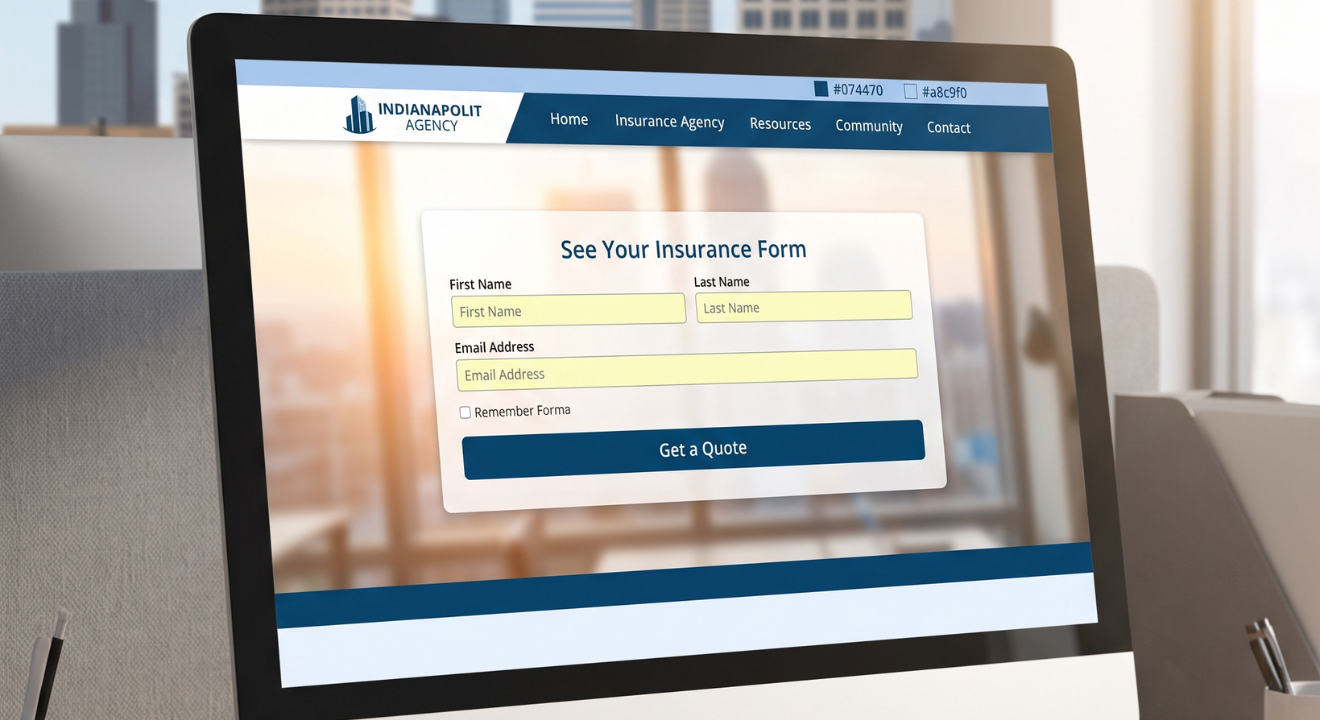
Your insurance agency website is your digital front door. Before a prospect ever picks up the phone or walks into your office, they have already visited your site, formed an opinion, and decided whether you are worth contacting.
That is a lot of pressure on a web page.
The reality is that modern insurance buyers start their journey online. They search, compare, and shortcut the process by going straight to agencies that make it easy to take action. If your insurance agent website is not built to meet them where they are, they simply move on to a competitor who is better prepared.
The stakes are high. One regional agency discovered this the hard way when younger consumers aged 25 to 45 completely bypassed their site and went straight to national carrier websites. The reason was simple: the agency's site was purely informational with no quote forms, no self-service tools, and no way to take action. It generated essentially no measurable leads.
A strong insurance agency website design is not just about looking professional. It is about creating a lead-generation engine that works for your business around the clock. It is about removing friction, communicating your value clearly, and giving visitors a reason and a way to choose you over the competition.
The agencies winning online right now understand this. And the agencies falling behind are often the ones still treating their websites as digital brochures.
If your website for an insurance agency is not generating consistent quote requests, you are not alone. This is one of the most common challenges facing agencies today. And the reasons go much deeper than an outdated look.
Here are the core problems that prevent an insurance website that converts from functioning the way it should.
Many agency websites do a decent job of explaining what they offer. But they fail to give visitors a clear, easy way to move from interest to action. There are no quote request forms, no line-of-business landing pages, and no self-service tools. A generic "Contact Us" page handles everything, which means a casual browser and a ready-to-buy prospect go into the exact same funnel.
When a commercial lines prospect visits your site, they need to find the right intake path quickly. If your navigation is broad and unclear, they will not dig around looking for it. They will leave. The same problem appears when sites treat all visitors the same way, whether they are personal lines clients, commercial buyers, or existing policyholders.
This is a problem that many agency owners do not see from the outside but feel every day. Generic forms collect barely any useful underwriting detail, so staff spend time chasing missing information by phone and email. Inquiries get manually copied and pasted into internal systems, introducing delays that hurt close rates. Disconnected tools across your CRM, lead tracking, and service requests make it nearly impossible to follow up efficiently.
Aging WordPress templates, slow loading speeds, and platforms that cannot support modern features like instant quote calculators or mobile-friendly forms all contribute to poor performance. One agency suffered an 18% year-over-year decline in new business even as online insurance shopping was increasing, partly because their platform simply could not keep up.
If your agency has 11 Google reviews and your competitor has 50 or more, prospects are going to choose them before they even read a single word on your site. Low organic rankings for local insurance keywords mean less inbound traffic. Less traffic means fewer opportunities to convert.
The problem, in short, is not just ugly design. An underperforming agency website is an underperforming lead source, an unnecessary admin burden, and a quiet drain on your brand credibility.
The best insurance agency websites are not built around what looks nice. They are built around what works. Effective insurance web design is rooted in three core decisions: who you want to attract, what information you need to capture, and where that information flows after someone converts.
Here is what a high-performing, conversion-focused agency site includes.
Every line of business your agency offers should have its own dedicated landing page. Home insurance, auto insurance, commercial coverage, life insurance — each deserves a tailored page with a tailored quote form. When someone searches "commercial auto insurance quote" in your area, they should land on a page built specifically for that search, not a generic homepage.
The navigation and content flow of your site should be built around your visitors' needs, not your internal org chart. Personal lines clients need one clear path. Commercial buyers need another. Existing clients looking to service their policy need a third. When each visitor can immediately see where to go, they stay longer and convert more.
Forms on your site should collect the underwriting details your producers actually need. That means no more back-and-forth to gather basic information. Better yet, those form submissions should automatically route into your CRM or agency management system so leads get followed up on fast, while the prospect is still warm.
Your site's layout should do the work of guiding visitors toward a quote. Engaging visuals, clear copy, strategic placement of trust signals, and prominent calls to action all work together to reduce bounce rates and keep visitors on your pages longer.
Carrier logos, years in business, claims satisfaction data, and Google reviews are powerful trust signals. Agent profiles with professional photos, short bios, and scheduling tools help humanize your agency and reinforce the relationship-based model that makes independent agents special.
If your insurance website that converts is not working seamlessly on a smartphone, it is not really converting at all.
More than half of all web traffic now comes from mobile devices. Insurance shoppers routinely compare options on their phones while sitting on their couch, waiting in line, or taking a lunch break. If your site delivers a clunky experience on mobile, those prospects are gone.
One agency case study found that the mobile experience was particularly painful on forms, making it frustrating for prospects to complete quote requests. That friction does not just reduce form completions. It sends a message about your agency: that you are not easy to work with.
Mobile responsiveness is also critical for your paid advertising return. If you are running Google Ads and sending traffic to a page that loads slowly or has tiny tap targets on a phone screen, a large portion of that spend is wasted. Studies across industries consistently show that even a one-second delay in mobile page load can significantly impact conversion rates.
A mobile-ready insurance agency site needs:
Getting mobile right is not optional. It is the baseline for any modern insurance web design that wants to compete.
Your insurance agent website can have great content, beautiful design, and solid SEO. But if visitors do not know what to do next, they will do nothing.
Clear CTAs, or calls to action, are the bridge between a visitor browsing your site and a prospect requesting a quote. Every high-converting insurance site uses them strategically and consistently.
Instead of a single generic "Contact Us" button, give visitors specific, relevant next steps based on the page they are on. A visitor reading your home insurance page should see "Get a Home Insurance Quote." A visitor on your commercial lines page should see "Request a Commercial Coverage Consultation." Specificity signals relevance and reduces hesitation.
Agent profile pages work especially well with integrated scheduling tools like Calendly, allowing prospects to book a consultation directly without playing phone tag. Commercial lines buyers need different CTAs than personal lines shoppers. Treating them the same sends both to a generic funnel that serves neither well.
Your most important CTA — whether it is "Get a Quote" or "Start Your Free Review" — should appear in the hero section at the top of the page. It should also be repeated at logical decision points throughout the content: after you explain your coverage options, after a testimonial, after an FAQ section. Visitors do not always scroll from top to bottom, so meet them wherever they are in the page.
The best insurance websites also offer multiple next steps to accommodate different levels of buyer readiness. Some visitors are ready to quote right now. Others want to schedule a call first. A few might want to download a guide before committing to anything. Giving people options increases the chance that at least one of those paths matches where they are today.
Speed and user experience are not just technical concerns for developers. They are directly tied to how many quote requests your insurance web design generates.
When a user lands on your site and the experience is confusing, fragmented, or slow, they disengage. They cannot find what they need, they lose confidence in the agency, and they leave. One large insurer found that organizing its website around internal structures instead of user needs made navigation complex and inefficient, leading to lower engagement and missed business opportunities.
The operational side matters just as much as the front-end experience. When a prospect submits a quote request on your site and that information has to be manually copied into your internal system, time passes. And in insurance, response time directly affects close rates. Prospects who fill out a form and wait hours for a callback often move on to someone faster.
Here is how speed and UX connect to your bottom line:
A slow, confusing website does not just frustrate visitors. It actively costs your agency leads, revenue, and marketing budget.
One of the most powerful things your insurance agent website can do is communicate why someone should choose you specifically. Not just that you sell insurance, but that you are the right agency for this particular person's needs.
This is where showcasing your agency value becomes a real competitive advantage.
Carrier logos from the companies you represent, your years in business, claims satisfaction rates, and a strong collection of Google reviews all tell a prospect: this agency is established, capable, and trusted. One agency made systematic review generation a key part of their strategy, triggering review requests after policy renewals and successful claims. The result was a growing base of social proof that influenced how prospects perceived them before they even read a word of content.
Independent agencies have a significant advantage over national carriers: real relationships with real people. Lean into that. Agent profiles with professional photos, bios that highlight expertise, and scheduling tools make it easy for prospects to connect a name and a face to your agency. This reinforces the relationship model while making your agency accessible through modern, digital channels.
Your messaging should focus on what the experience of working with your agency looks like. How fast do you respond? What happens after someone submits a quote? Do you specialize in a particular niche, like commercial transportation or contractors or high-value homes? Customer-centric messaging that emphasizes personalized service and genuine expertise will differentiate you far more effectively than competing on price alone.
Prospects are more likely to convert when they know what to expect. Explain what happens after they submit a quote request. Tell them how quickly they will hear back. Show them the steps involved in getting covered. This kind of transparency builds confidence and reduces the hesitation that keeps visitors from clicking that quote button.
The following examples are drawn from real case study narratives and illustrate the kinds of transformations that are possible when agencies invest in strategic website redesigns.
Before the redesign, this regional agency operated a website that was purely informational. There were no quote forms, no landing pages, no conversion tracking, and no lead infrastructure of any kind. The agency had only 11 Google reviews while competitors had 50 or more. Younger consumers in the 25 to 45 age range were bypassing the agency entirely and going straight to national carrier websites.
After the overhaul, the agency launched dedicated landing pages for every line of insurance, each with an instant quote request form tailored to that coverage type. Agent profiles with integrated Calendly scheduling were added throughout the site. Trust signals including carrier logos, years in business, and satisfaction rates were woven into key pages. In the second phase, geo-targeted Google Ads campaigns were launched, directing paid traffic to intent-matched landing pages. A systematic review generation program was also introduced, triggered after renewals and claims.
The transformation took the site from a static brochure to a working lead-generation system capable of competing for younger, digitally-savvy insurance shoppers.
This agency was experiencing an 18% year-over-year decline in new business at a time when online insurance shopping was actually increasing. Nearly 45% of their digital ad spend was producing clicks that never turned into quote requests. Their platform could not support mobile-friendly forms, instant quote tools, or personalized user journeys. Their CRM, lead tracking, and service systems were all disconnected.
After implementing a conversion-focused redesign with integrated technology, the agency introduced instant quote calculators, mobile-optimized forms, and role-based navigation. Their back-end systems were connected so leads flowed seamlessly from the website into their CRM. Ad ROI improved because the conversion paths actually worked. The lesson here is that fixing the front-end design alone is not enough. Back-end integration is what turns a redesigned site into a revenue tool.
This agency had plenty of website traffic but almost nothing to show for it. Forms collected barely any underwriting detail, which meant staff were constantly chasing missing information. Submissions had to be manually transferred into internal systems, creating delays that hurt close rates. Navigation was vague, commercial prospects had no clear intake path, and every visitor was funneled into the same generic contact page.
The redesign focused on three decisions: who to attract, what to collect at conversion, and where that data should go internally. CTAs and intake paths were segmented by line of business. Forms were restructured to capture the underwriting information producers actually need. Submissions were automatically routed into internal systems. The result was better lead quality, reduced admin work, and a site that reflected the agency's true capabilities.
At Kusanku Marketing Solutions, our approach to insurance agency website design starts with strategy, not templates.
We know that independent agencies do not need a generic website. You need a site that attracts the right prospects, captures the right information, and feeds leads into your workflow in a way that supports fast, effective follow-up.
Here is how we help:
Before we design a single page, we work with you to understand who you want to attract, what information you need from them at the point of conversion, and how that data should flow into your internal systems. This mirrors the three-decision framework that consistently separates high-performing agency sites from those that generate traffic without results.
We build dedicated pages for each type of coverage you offer, each with tailored quote forms and clear calls to action. We ensure every page is mobile-responsive and loads quickly, so both your organic search traffic and your paid ad spend convert at the highest possible rate.
We set up automation so that quote requests flow directly into your CRM without anyone copying and pasting. We also implement review generation workflows that trigger at key moments in the customer lifecycle, building your Google ratings and online reputation consistently over time.
We structure your site around your visitors' needs, not your internal org chart. Personal lines clients, commercial buyers, and existing policyholders each get a clear, direct path to what they are looking for. We highlight your trust signals, your team's expertise, and the quality of your service so your site works as hard as you do to win new business.
If your current site is holding your agency back, we can help you change that.
Your insurance agency website should be one of your hardest-working team members. It should welcome prospects, answer their questions, build their trust, and guide them toward requesting a quote, all without you having to be in the room.
If it is not doing that today, every week that passes is a week of missed opportunities.
The good news is that the path forward is clear. The agencies that have transformed their digital presence share a common approach: they stopped treating their websites as brochures and started treating them as lead-generation systems. They built intent-matched landing pages, frictionless user journeys, integrated intake forms, and trust signals that communicate real credibility.
The results speak for themselves. More qualified leads. Less admin work. Better close rates. And a brand presence that holds its own against national carriers and better-funded competitors.
Ask yourself honestly: is your current website helping you grow, or is it quietly blocking the leads you deserve?
If it is time for a change, Kusanku Marketing Solutions is here to help you build something that actually works.
A prospect may be asking ChatGPT for an insurance agency right now. We'll show you what it says about you — and who it's recommending instead.


No cost, no obligation · Delivered in 3 business days · Prepared by Lee
We'll check what ChatGPT, Google AI, Perplexity, and Gemini say about you — and who they're recommending instead. Free, and yours in 3 business days.
A high-performing website for an insurance agency goes beyond just looking good; it is a lead-generation engine. This means it has clear calls to action, easy navigation, mobile responsiveness, integrates with your CRM, and effectively communicates your agency's value and expertise to convert visitors into quote requests.
Common reasons for low conversion include a focus on information rather than action (no clear quote forms), vague navigation leading to unclear user journeys, operational friction from manual data entry, outdated design hindering functionality, and poor online visibility or weak brand perception due to lack of trust signals like reviews.
Mobile responsiveness is crucial. Over half of all web traffic comes from mobile devices, and insurance shoppers frequently use their phones to compare options. A non-mobile-friendly site creates a poor user experience, leading to high bounce rates and lost leads. It also negatively impacts your paid advertising ROI and search engine rankings.
Clear CTAs are explicit instructions guiding visitors on what to do next (e.g., "Get a Home Insurance Quote", "Schedule a Consultation"). They are essential because they bridge the gap between a visitor's interest and their action. Specific, visible, and persistent CTAs, tailored to the page content and target audience, significantly increase conversion rates by making the next step obvious and easy.
Showcase your value by building credibility with trust signals (carrier logos, years in business, Google reviews), humanizing your team with agent profiles, leading with quality service over price, and showing transparency in your process. These elements help differentiate your agency, foster trust, and reinforce the relationship-based model independent agents offer.
Bought leads are the only asset in your agency that disappears the month you stop paying for it. Everything else in this guide, you keep.
Download Free


